Overview
The most useful way to understand what makes a property company website perform commercially is to look at real examples: the specific challenges each company faced, the design and structural decisions made in response, and the commercial outcomes those decisions produced. Portfolio screenshots tell you what a site looks like. Understanding the reasoning behind the decisions tells you what to think about for your own project.
This guide draws on three property website builds from Rudo's portfolio, covering real estate capital advisory, property investment, and PropTech — three different property business models with three different audiences, built on three different platforms, each solving a distinct commercial challenge.
In this article:
- What makes a high-performing property website
- Impera Finance: real estate capital advisory
- Source Investments: multi-audience property investment
- GetGround: PropTech SaaS platform
- What the three sites have in common
- Applying these lessons to your property website
This article is part of the complete guide to web design for property companies.
Find out more about our property web design service.
1. What makes a high-performing property website
Before examining specific examples, it is worth establishing the criteria by which a property website should be evaluated. Visual design is one criterion among many, and rarely the most commercially important one.
- Trust established within the first scroll. For any property company asking visitors to consider a significant financial commitment, the above-fold content must answer the question 'can I trust this company' before the visitor scrolls. Track record indicators, regulatory credentials, and named client evidence accomplish this. Aspirational imagery and generic headlines do not.
- Audience-specific content journeys. A property website that serves multiple buyer or investor types must provide distinct pathways for each — not one undifferentiated journey that tries to serve everyone simultaneously and serves no one particularly well.
- Commercial conversion architecture. The path from initial interest to enquiry should be deliberate, frictionless, and designed for the timescales of a considered financial decision. Multiple conversion entry points for different stages of the decision journey consistently outperform single call-to-action designs.
- CRM connectivity. Every enquiry, download, and page engagement tracked and attributed in a CRM that the commercial team can act on. Property deals are long. CRM connectivity turns the website from a brochure into a lead generation and nurturing system.
- Marketing independence. The CMS and template architecture should allow the marketing team to add case studies, publish market commentary, build campaign landing pages, and update service content without raising a developer ticket.
2. Impera Finance: real estate capital advisory
The client and the challenge
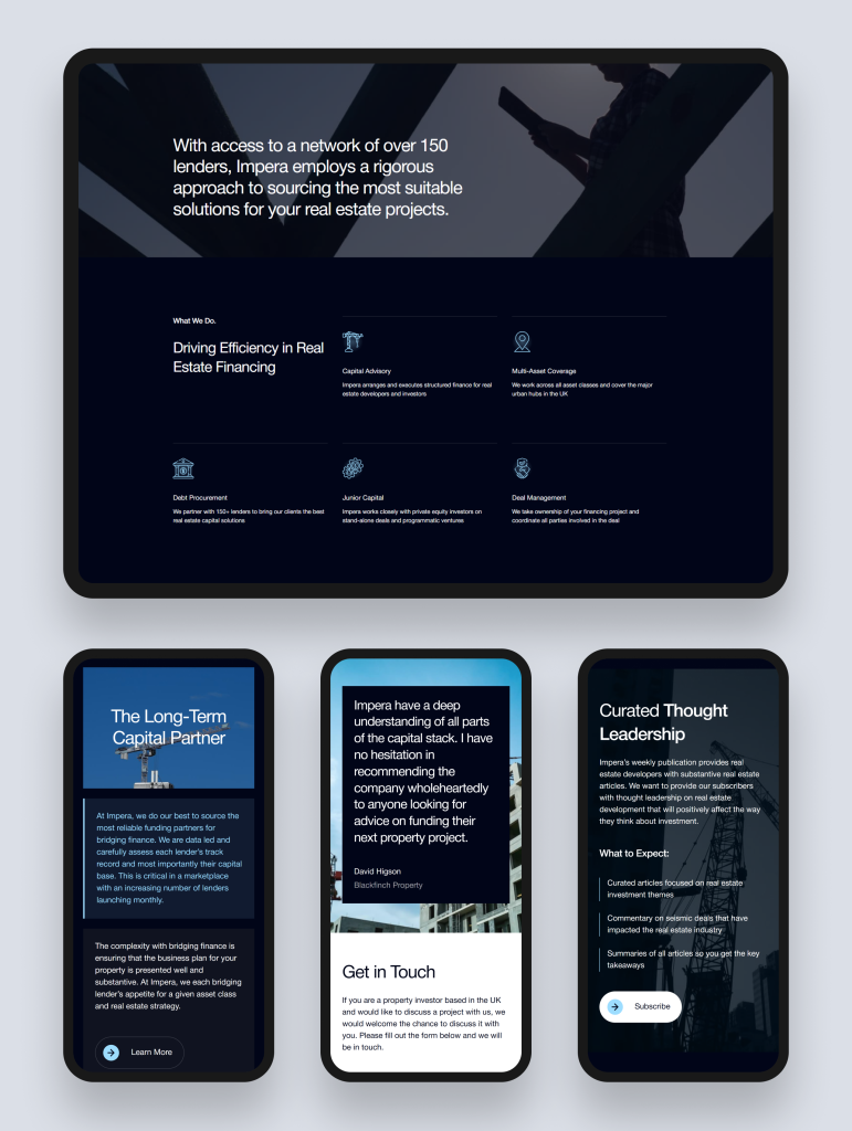
Impera Finance is a London-based real estate finance advisory that has arranged and executed more than £500 million in funding across debt and equity transactions. Their extensive lender network and proven track record positioned them strongly in the market — but their previous website communicated neither their reputation nor their analytical depth to the sophisticated developers and investors who evaluate advisory firms online before making contact.
The challenge was twofold: design a website that instilled trust with property developers and investors considering placing substantial debt or equity requirements with the firm, and build the marketing infrastructure needed to generate qualified leads through LinkedIn campaigns and organic search. Neither had been possible on the previous platform.
The design and build decisions
Rudo began with a comprehensive discovery phase: stakeholder interviews with the Impera team to understand their client types, the nature of their deal flow, and the specific credibility signals their market looks for. The information architecture was built to surface Impera's track record as the primary commercial asset — positioned above the fold as a specific number (£500m+), not buried in an about page as a vague claim.
The design system communicated institutional authority: restrained palette, precise typography, high-quality photography of real team members, and a visual language calibrated to the expectations of professional developers and institutional investors. A custom WordPress theme was built for technical performance and SEO readiness. A suite of conversion-focused campaign landing pages was designed and built for Impera's LinkedIn activity, each targeting a specific developer profile and optimised for that audience's specific conversion path.
HubSpot CRM was integrated natively, with form logic routing enquiries by type (debt vs equity, deal size range, asset class) to the appropriate team member with full attribution data attached.
The outcomes
Within three months of launch, Impera saw a 35% increase in visitor engagement, a 25% boost in page views per session, and 20% growth in organic traffic. The campaign landing page infrastructure became an active part of the firm's lead generation programme, with LinkedIn campaigns driving qualified developer enquiries at a measurable cost per lead.
Read the full case study: Impera Finance case study.
What to take from this
For advisory and capital markets firms, the track record is the product. Every design and structural decision should be oriented around communicating the track record as specifically and prominently as possible. The campaign landing page infrastructure is not a luxury add-on — for firms using LinkedIn for business development, it is the mechanism by which the website generates pipeline rather than merely existing.
3. Source Investments: multi-audience property investment
The client and the challenge
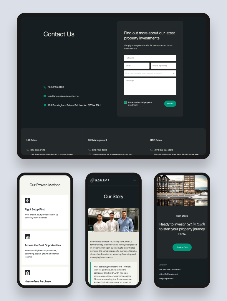
Source Investments is a UK-based property investment company helping clients buy, manage, and sell residential investment properties. Over the preceding decade, the team had grown from 5 to 13 and the client base had expanded to include international investors from Turkey and the UAE alongside UK-based buyers. The company also operated a sister brand, Home Cloud, providing property management and sales services.
Their existing website presented a single, undifferentiated property investment offering that spoke to none of their three distinct audiences effectively: new investors needing education and reassurance, existing landlords evaluating portfolio management, and international buyers navigating the UK property market for the first time. The buy-manage-sell three-service structure was not communicated clearly. The HubSpot CRM that the company had recently adopted had no connection to the website. The Home Cloud sister brand needed a rebrand and a website with API-driven property listing functionality.
The design and build decisions
Rudo's discovery process identified that Source wanted to position closer to Property Hub — a service and trust brand — than to transactional listing platforms. This strategic insight shaped every content and design decision downstream.
The new sitemap broke the three services (buy, manage, sell) into clearly defined sections with distinct content for each, while also creating three audience-specific journeys: new investors, existing landlords, and international buyers. Each journey led visitors through content relevant to their specific context and converged on a conversion architecture appropriate for their decision stage.
A modular design system was built to allow Source's marketing team to update and expand the site without developer dependency. Custom HubSpot campaign landing pages were designed and connected to the CRM for targeted campaign activity to each audience segment. For Home Cloud, Rudo delivered a redesigned brand identity and a website with API functionality for automated property listing.
The outcome
The new Source Investments website functions simultaneously as a lead generation engine for new investor acquisition, a brand showcase that reflects the company's current scale and sophistication, and an onboarding touchpoint that sets the tone for the client relationship from the first digital interaction.
Read the full case study: Source Investments case study.
What to take from this
For property investment companies serving multiple investor types, audience segmentation is the most commercially important structural decision in the project. A website that tries to serve a first-time buy-to-let investor and an experienced UAE-based landlord with the same content journey serves neither well. The additional strategic investment required to design distinct journeys is consistently justified by the improvement in conversion across all audience types.
4. GetGround: PropTech SaaS platform
The client and the challenge
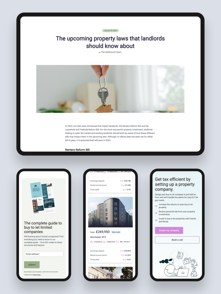
GetGround is the UK's only digital company formation and management platform for buy-to-let property investment — enabling investors to source, finance, and establish tax-efficient limited company structures for property acquisition. The platform addressed a real and significant gap in the UK BTL market, where most investors either navigated the complexity of limited company structures with expensive professional advisers or avoided the structure entirely at the cost of significant tax inefficiency.
The existing website failed to convey the platform's ambitious goals or its genuine innovation. More critically, it did not guide the diverse user base — from seasoned portfolio investors to first-time BTL buyers — through the platform's capabilities and value proposition. The lack of navigational clarity created friction in the acquisition funnel and prevented the website from functioning as an effective user acquisition channel.
The design and build decisions
Rudo began with a comprehensive sitemap that organised content around both user type and user journey stage, creating distinct paths for different investor profiles. Updated copy, new illustrations, and redesigned layouts for major pages were produced collaboratively with the GetGround team. Wireframes ensured optimal user flow through the platform's three core services — property sourcing, mortgage solutions, and company creation — with each service explained in problem-first terms before the mechanism and outcome were introduced.
HubSpot CMS was chosen as the platform for its integrated marketing tools, its audience segmentation capabilities, and its content management usability for a fast-moving product team. Campaign landing pages and CRM routing were configured to support the marketing team's ongoing user acquisition activity.
The outcome
The redesigned website improved navigation across all user types, increased market awareness and user engagement, and provided the GetGround team with a content management platform they could operate at the pace of their product development. The site solidified GetGround's position as an innovator in the real estate SaaS landscape — a credibility that their previous website had failed to communicate.
Read the full case study: GetGround case study.
What to take from this
PropTech websites fail most often at the product explanation stage. A platform solving a genuinely important problem in the property market can still fail to acquire users if the website does not explain the problem clearly before it explains the solution. Designing the information architecture around the user's experience of the problem — rather than around the product's features — is the single highest-value decision in a PropTech website project.
5. What the three sites have in common
Despite serving three different property business models and three different audience types, the three sites share a consistent set of characteristics that explain their commercial performance.
- Strategy before design in every case. All three projects began with a discovery phase that produced specific strategic outputs: buyer personas, audience journey maps, a competitor analysis, and a commercial goal definition. The design work began only once this foundation was in place. This is the single most common differentiator between property websites that work commercially and ones that merely look good.
- The audience complexity was taken seriously. All three clients served more than one audience type. In all three cases, the website architecture was built to serve each audience distinctly — with separate journeys, separate content, and separate conversion paths — rather than applying a single design to all audiences and hoping for the best.
- CRM was integrated from the start. All three websites connected natively to HubSpot CRM. Every enquiry, campaign landing page submission, and content engagement was tracked and attributed from launch day. Property deal timescales make this non-negotiable: leads that cannot be nurtured over a 6 to 18 month decision period are leads lost.
- The CMS was built for independence. All three clients can manage their own content post-launch: publish case studies, update service descriptions, build campaign landing pages, and add market commentary without raising a developer ticket. This independence is not a feature — it is a commercial requirement for companies running active marketing programmes.
Ready to build a property website?
Rudo designs and builds property websites for investment companies, advisories, developers, and PropTech platforms. Book an intro call — we will look at your current website, discuss your audiences, and give you an honest view of what it would take to build something that genuinely generates enquiries.
6. Applying these lessons to your property website
The commercial principles that made these three websites work are not specific to the companies involved. They apply to any property business with a serious ambition to use its website as a commercial channel rather than a brochure.
Find out more about our property web design service.
Also in this series: property investment website design, PropTech website design, property website design examples, how to choose a property web design agency.
Back to the complete guide to web design for property companies.

Written by
Rudo Agency
Rudo is a strategy-led web design and development agency specialising in B2B. Based in the UK and working with clients globally, we help ambitious brands turn complex ideas into high-performing websites. Our team combines digital strategy, UX/UI design, custom development, and SEO to deliver results-focused websites that support real business growth.
