Overview
Fintech companies occupy a demanding position in the web design landscape. They are technology businesses — with the fast iteration cycles, investor-facing pressures, and product complexity of a SaaS company — operating in financial services, where the trust and credibility expectations are set by regulated institutions. The website has to satisfy both sets of expectations simultaneously: polished and technically sophisticated enough to compete with the best SaaS product sites, credible and transparent enough to meet the standards of financially sophisticated users making real decisions about their money.
Most fintech websites fail at one or the other. They achieve visual sophistication without financial credibility, or financial credibility without the product clarity that converts users. This guide covers the design and strategic decisions that make fintech websites work commercially across their distinct audience types.
In this article:
- The fintech website design challenge
- Fintech audience types and what they need
- Explaining complex financial products clearly
- Trust and credibility in fintech design
- Regulatory considerations for fintech websites
- Conversion architecture for fintech
- Platform choice for fintech companies
- Case study: Tolerisk
- Frequently asked questions
This article is part of the complete guide to financial services website design.
Find out more about our financial services web design agency.
1. The fintech website design challenge
Fintech is a broad category. It includes payment platforms and neobanks, investment apps and robo-advisors, insurance technology and lending platforms, risk analytics tools and company formation software. What these products share is the challenge of communicating something technically complex and financially consequential to users who may be approaching the category for the first time.
The design challenge has two dimensions. The first is clarity: fintech products typically solve problems that users did not know they had, or solve familiar problems in unfamiliar ways. The website has to make the problem vivid and the solution accessible before it can sell anything. The second is trust: fintech products handle money, data, and financial decisions with real consequences. A user who does not trust the product enough to commit their financial information — even if they understand what the product does — will not convert.
| The sequence that matters |
| Problem → Solution → Trust → Conversion. A fintech website that leads with product features without first making the problem vivid is starting in the wrong place. A website that establishes the problem and solution but fails to earn trust will lose users at the conversion step. The design of every page — and the sequence of sections within each page — should follow this logic deliberately. |
2. Fintech audience types and what they need
Retail users: new to the category
Approaching fintech for the first time. May not fully understand the problem the product solves. Need: the problem framed in terms they recognise from their own financial life, evidence that the solution actually works for people like them, reassurance about security and what happens to their money or data, and a frictionless path to getting started. The biggest barrier for this audience is not scepticism about the product — it is uncertainty about whether they need it.
Financially sophisticated users
Investors, portfolio managers, financial advisors, or experienced users evaluating a new financial tool. Need: technical depth, regulatory credentials, integration capabilities, and performance data. They are evaluating the product against professional alternatives they already use. The design must be credible enough to stand scrutiny from this audience without becoming inaccessible to the retail user. Layered content — accessible at the surface, deep on demand — serves both.
Institutional or professional users
Fund managers, compliance teams, treasury functions, or corporate finance teams. Evaluating the product for professional deployment. Need: security certifications, compliance documentation, SLA guarantees, integration specifications, and case references from comparable institutional users. The conversion path for this audience typically involves a demo or a sales conversation rather than a self-serve signup — the website's job is to generate the qualified meeting, not the direct sale.
Investors and press
VCs, angels, journalists, and industry analysts who arrive at the website to evaluate the company rather than the product. Need: the founding team's credentials, the product's market positioning, traction indicators, and evidence of commercial momentum. For early-stage fintech companies, the investor and press audience is commercially significant — a favourable mention in a relevant publication or a warm VC introduction can move the business significantly. The website should serve this audience explicitly, not as an afterthought.
3. Explaining complex financial products clearly
Fintech products frequently involve concepts that are new, complex, or counterintuitive to first-time users. The quality of the product explanation on the website is often the primary determinant of conversion — not the design, not the brand, and not the marketing spend behind the traffic.
Problem-first framing, always
Every fintech homepage should answer the problem question before the product question. What is the specific problem this product exists to solve? Who experiences it? What does life look like when it is not solved? A fintech company whose homepage leads with product features rather than buyer problems is designing for the people who already understand the category — which is a small subset of the addressable market.
The three-part explanation structure
For complex fintech products, three elements presented in sequence consistently outperform longer or more complex explanation structures: the problem (specific, vivid, recognisable to the target user), the mechanism (the key innovation or process that makes the solution work — one clear thing, not a list of features), and the outcome (what the user's financial life looks like after the problem is solved). This structure works for hero sections, product pages, and campaign landing pages.
Product illustration over text description
Financial technology products are difficult to explain in text but often straightforward to demonstrate visually. Product screenshots in context, animated process diagrams, before-and-after workflow comparisons, and short video walkthroughs convert significantly better than text-only product descriptions for complex fintech propositions. The investment in high-quality product illustration is consistently justified by conversion improvement.
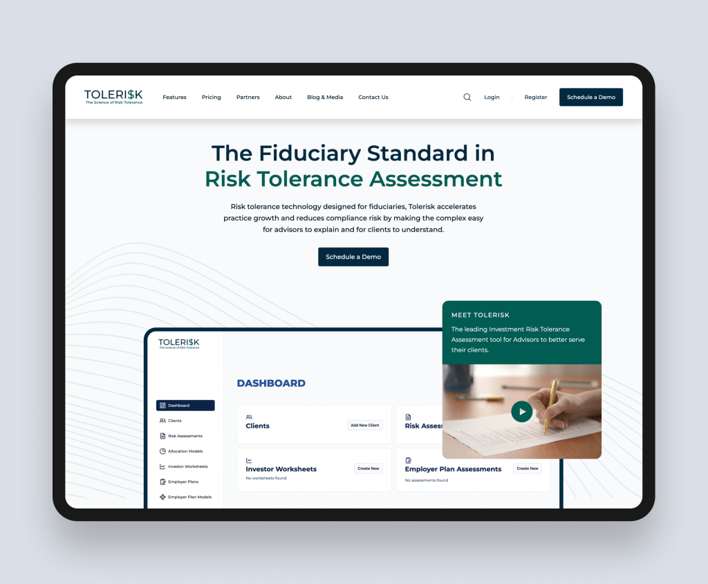
| Case study: Tolerisk (Financial SaaS — investment risk analytics for financial advisors, WordPress) |
| Tolerisk is a math-intensive financial SaaS platform providing investment risk modelling tools for financial advisors. The core challenge of the marketing website was communicating a genuinely complex analytical product clearly to an audience of professional financial advisors who would evaluate it against established alternatives. Rudo built a custom WordPress marketing site that led with the problem — the limitations of conventional risk tolerance assessments — before introducing the mechanism (Tolerisk's mathematically rigorous approach) and the outcome (better-matched investment portfolios for advisors' clients). The site launched alongside the application release within a six-week deadline, meeting both the commercial timeline and the design standard required to represent a premium financial analytics platform. Full case study: rudo.co.uk/case-studies/tolerisk/ |
4. Trust and credibility in fintech design
Trust in fintech is built through a specific combination of signals that users have learned to look for — consciously or not — when evaluating whether a financial technology product is safe to use.
Security and data handling
Fintech users are handing over financial data, bank credentials, investment information, or payment details. Security signals — encryption standards, security certifications, data handling policies presented in plain language — should appear at the conversion points where this concern is most active: the signup form, the pricing page, and the data permission screens. A general security page linked from the footer is not sufficient.
Regulatory status
FCA authorisation, e-money institution registration, FSCS protection, and any sector-specific approvals (BNPL registration, investment platform authorisation) should be visible and verifiable. For products operating in regulated activities, the absence of visible regulatory credentials is itself a trust-destroying signal. Users who have been burned by unregulated financial products are actively looking for regulatory evidence — make it easy to find.
Social proof that fits the financial context
Named users with specific outcomes — the investor who grew their portfolio by a specific percentage, the financial advisor who saved a specific number of hours per week, the business that reduced payment processing costs by a specific amount — are far more persuasive in fintech than generic star ratings or anonymous testimonials. Where the product's regulatory context allows publication of performance data, use it. Where it does not, outcome-focused testimonials from named users in recognisable sectors are the next best option.
Team and company credibility
Who built this product matters to financially sophisticated users. Founders with backgrounds at recognisable financial institutions, regulatory bodies, or successful fintech companies carry credibility that generic biographies do not. The team page of a fintech company is a commercial asset — not a formality.
5. Regulatory considerations for fintech websites
Fintech companies operating in regulated financial activities face the same FCA compliance obligations as any other financial services firm. The distinction fintech sometimes draws — 'we are a technology company, not a financial services company' — does not affect the regulatory treatment of the communications. If the website describes or promotes regulated financial activities, it is likely to constitute a financial promotion subject to COBS 4 requirements.
For consumer-facing fintech products, Consumer Duty (effective 2023) adds specific requirements around how the website supports good client outcomes. Design patterns that create false urgency, obscure risk information, or present returns without appropriate context may be considered contrary to Consumer Duty — regardless of how widespread they are in consumer product design generally.
The practical implication: build compliance review into the content production workflow from the start. Treat it as a project parameter, not a post-launch check.
For a full overview of FCA compliance in financial services websites, read the complete guide to financial services website design.
6. Conversion architecture for fintech
Multiple conversion entry points
Not all fintech visitors are ready to sign up or book a demo on first visit. Conversion architecture should offer options for different stages of the decision journey: a free guide or educational resource for early-stage researchers, a product walkthrough or demo for mid-stage evaluators, and a direct signup or consultation for visitors who are ready to proceed. Each entry point captures a different visitor cohort and feeds a different nurture path.
Self-serve vs sales-assisted conversion
Fintech products serving retail users typically need self-serve conversion: the sign-up should be completable without any human involvement. Products serving professional or institutional users typically need sales-assisted conversion: the website's job is to generate a qualified meeting, not a direct sale. These require different conversion designs. A retail fintech product that buries its signup behind a 'request a demo' form is losing users who would have converted independently. A professional fintech tool that exposes a self-serve signup without any qualification step is creating noise in the sales pipeline.
Onboarding as a conversion factor
For self-serve fintech products, the conversion does not end at signup. A user who completes account creation but abandons during onboarding has not become a customer. The website's role in onboarding — the expectations it sets about what the setup process involves, the social proof it provides about how other users have succeeded, and the clarity with which it explains what the user needs to do next — directly affects activation rates. The line between marketing website and product onboarding should be deliberately designed, not accidentally discovered.
7. Platform choice for fintech companies
- HubSpot CMS: For fintech companies with active acquisition campaigns across multiple audience segments who need native CRM integration, smart content delivery, and campaign landing page flexibility without developer dependency. Particularly strong for B2B and professional-user fintech where the sales cycle involves multiple touchpoints and nurture sequences.
- Webflow: For design-led fintech brands at earlier stages of marketing maturity where visual quality is a competitive differentiator and the content operation is not yet complex enough to require CRM-native personalisation. Strong design fidelity at competitive build cost.
- WordPress: For fintech companies with complex content operations, large editorial teams, specific third-party integration requirements, or data sovereignty needs that managed platforms cannot satisfy.
For a detailed platform comparison, read our guides to HubSpot CMS for B2B, Webflow for B2B, and WordPress for B2B.
8. Case study: Tolerisk
Tolerisk is a math-intensive financial SaaS platform designed for financial advisors. The platform provides rigorous, mathematically grounded investment risk modelling — a more analytically sophisticated alternative to the conventional risk questionnaires that most advisor practices rely on. The target audience is professional financial advisors who are evaluating Tolerisk against the tools they already use.
The challenge
The previous marketing website did not communicate the platform's analytical sophistication clearly to a professional audience. The design did not reflect the premium positioning of the product. And the project had a hard deadline: the marketing site needed to launch alongside the application release in six weeks.
The approach
Rudo worked collaboratively with the Tolerisk team to define a streamlined user flow and wireframes that captured the essence of the math-intensive platform for a financial advisor audience. A custom WordPress theme was built for speed, security, and tailored functionality. Rapid iteration on design and content through efficient communication and iterative review allowed updated style guides, design mockups, and a fully functional site to be delivered within the six-week window.
The outcome
The site launched on time alongside the application release. The custom WordPress theme optimised speed and security while delivering a seamless user experience for the financial advisor audience. The design elevated the Tolerisk brand and provided a robust digital foundation for communicating their value proposition at launch.
Read the full case study: Tolerisk case study.
Ready to build a fintech website that converts?
Rudo designs and builds fintech websites that explain complex financial products clearly, build appropriate credibility, and convert diverse user audiences. Book an intro call to discuss your product and your audiences.
9. Frequently asked questions
What makes a good fintech website?
A good fintech website leads with the problem before the product, explains the mechanism clearly through product illustration rather than feature lists, builds trust through specific security signals and regulatory credentials at the conversion points where they matter most, and offers multiple conversion paths suited to different stages of the decision journey. The design register should feel credible to financially sophisticated users — restrained enough to communicate institutional quality, modern enough to communicate technological capability.
How do you explain a complex fintech product on a website?
Problem first, mechanism second, outcome third. Make the problem vivid and specific before introducing the solution. Explain the mechanism — the one key thing that makes your approach different — in one clear statement rather than a list of features. Then show the outcome: what the user's financial life or workflow looks like after the problem is solved. Support text with visual product illustration: screenshots in context, process diagrams, or short demo videos.
Does a fintech website need FCA compliance review?
For fintech companies carrying out regulated financial activities, website content describing or promoting those activities is likely to constitute a financial promotion under COBS 4 and must be approved by an FCA-authorised person before publication. Consumer Duty also applies to consumer-facing fintech products, with implications for how the website presents information and shapes user decisions. Compliance review should be built into the content production process from the start of the project.
What platform should a fintech company use for its website?
HubSpot CMS for fintech companies with active acquisition campaigns across multiple audience segments who need native CRM integration and campaign landing page flexibility. Webflow for design-led fintech brands at earlier marketing maturity stages. WordPress for fintech companies with complex content operations or specific integration requirements. The decision should be led by the marketing team's operational requirements, not by the build cost.
Find out more about our financial services web design agency.
Also in this series: fintech website design, investment firm website design, wealth management website design, financial services website examples, financial services website cost.
Back to the complete guide to financial services website design.

Written by
Rudo Agency
Rudo is a strategy-led web design and development agency specialising in B2B. Based in the UK and working with clients globally, we help ambitious brands turn complex ideas into high-performing websites. Our team combines digital strategy, UX/UI design, custom development, and SEO to deliver results-focused websites that support real business growth.
