
Overview
Looking at what genuinely high-performing B2B websites do well is one of the fastest ways to identify what your own site is missing. Not the flashiest sites or the most award-winning designs, but the ones that actually generate leads, support sales cycles, and position companies clearly in competitive markets.
In this guide:
- What makes a B2B website genuinely good
- B2B SaaS and tech website examples
- B2B financial services website examples
- B2B healthcare website examples
- B2B property website examples
- B2B recruitment website examples
- What the best B2B websites have in common
This guide draws on Rudo's client work and the broader B2B landscape to highlight what works, and why it works. Every example includes a practical takeaway you can apply to your own site.
This article is part of our complete guide to B2B web design.
1. What makes a B2B website genuinely good
A genuinely good B2B website does these things well:
- Communicates clearly who it serves and what problem it solves, within five seconds
- Guides multiple buyer types through a complex, multi-stage research journey
- Builds trust through specific, named, credible social proof
- Makes it easy to take the right next step at every point in the journey
- Loads fast and works well on mobile
- Is easy for the marketing team to update and expand
2. B2B SaaS and tech website examples
What great SaaS websites do
The best SaaS websites make complex products understandable without dumbing them down. They lead with the problem the software solves (not the features it has), show the product in action quickly, and offer multiple conversion paths for buyers at different stages: free trial, demo request, and detailed documentation for the technical evaluator.
Rudo client example: Gravitee
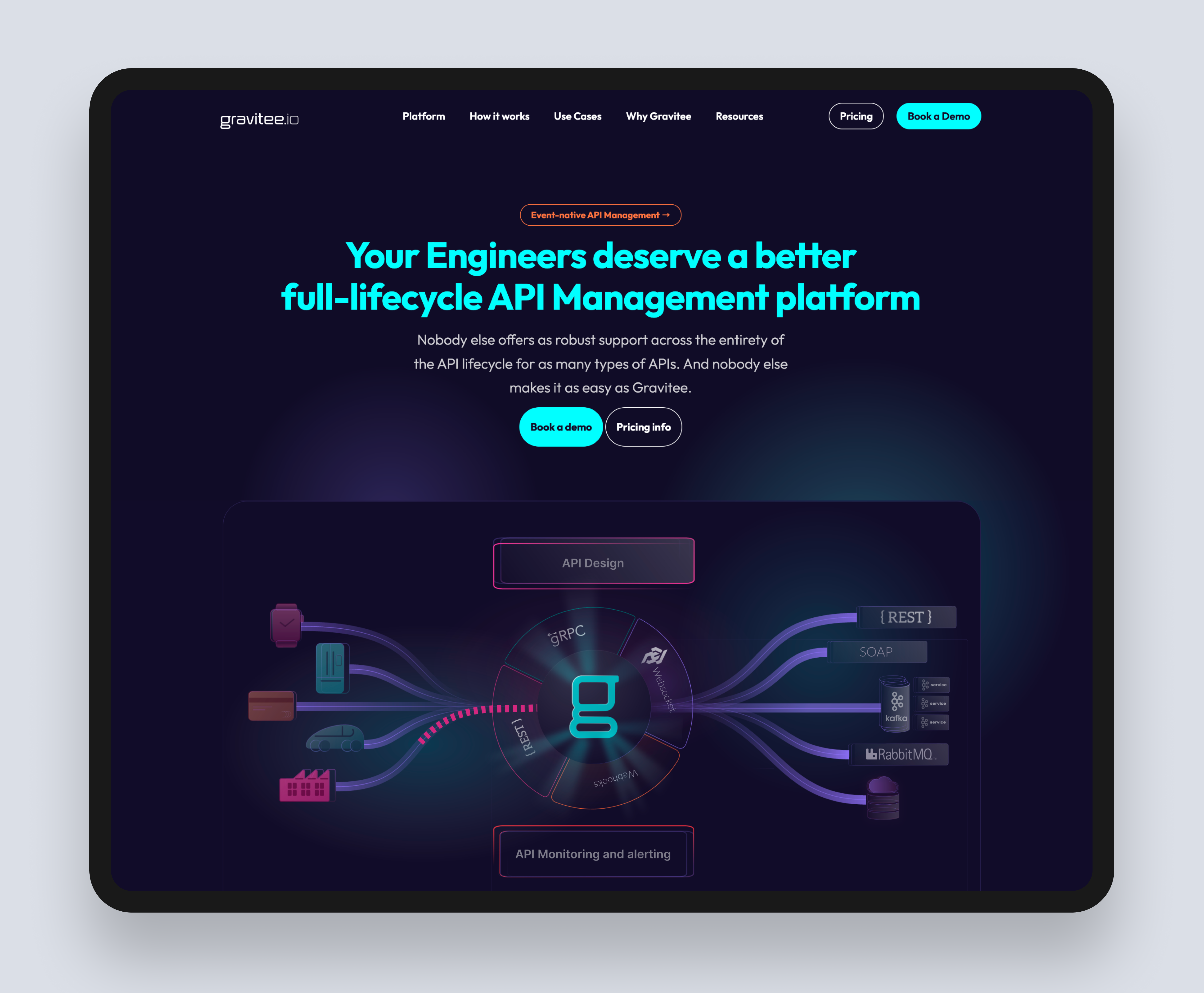
Gravitee is a leading API management platform serving enterprise technology teams globally. Their challenge was communicating a technically complex product to a technically sophisticated audience while also making the business case clear to non-technical buying stakeholders.
The Rudo-built site on HubSpot CMS restructured their content around distinct buyer journeys, created a comprehensive resources hub serving developers, architects, and procurement teams separately, and expanded the template library to give their marketing team the flexibility to build campaign landing pages without developer involvement.
Read the full case study: Gravitee case study.
Rudo client example: Event Footprints
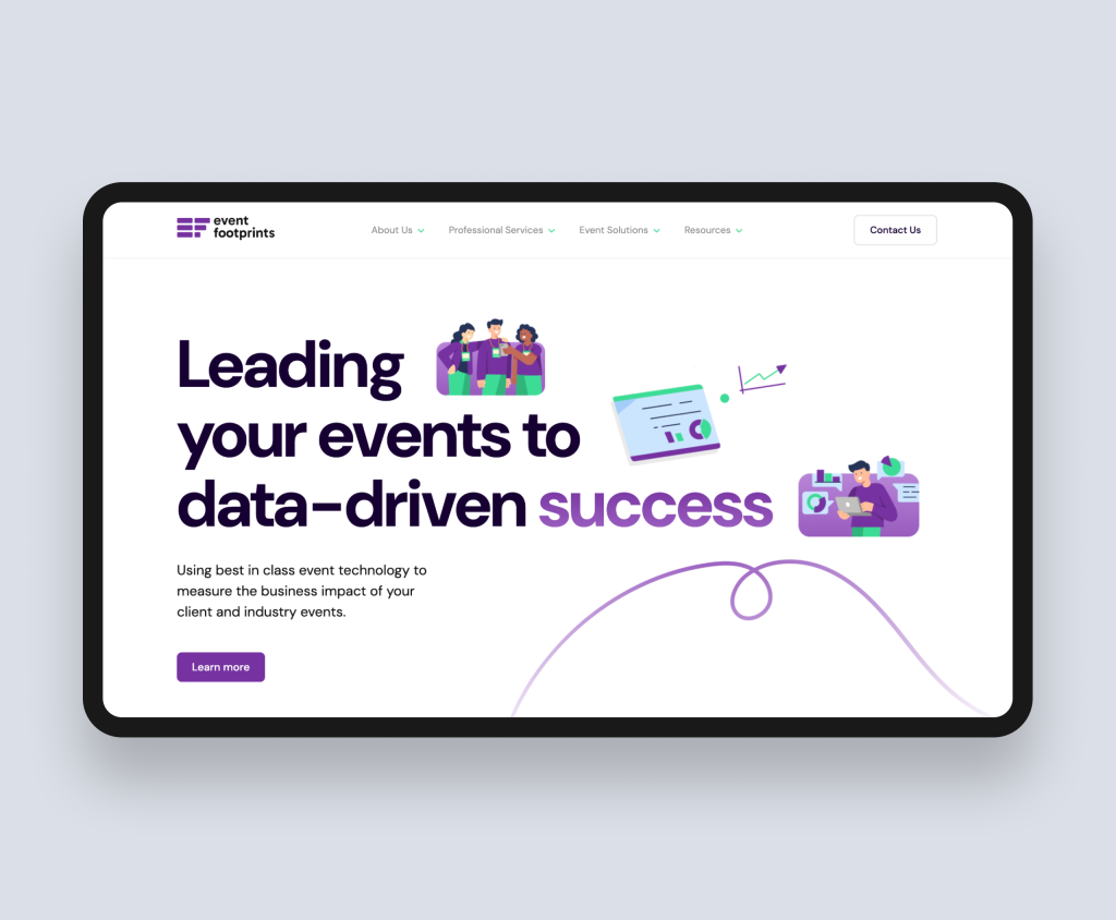
Event Footprints helps businesses measure the ROI of their events through behavioural data and analytics. Their original website did not communicate this clearly. The redesigned site on HubSpot CMS led with the core value proposition immediately, restructured content so the platform's benefits were clear across different audience types, and integrated with HubSpot CRM for seamless lead tracking.
Read the full case study: Event Footprints case study.
Rudo client example: Practice Gateway
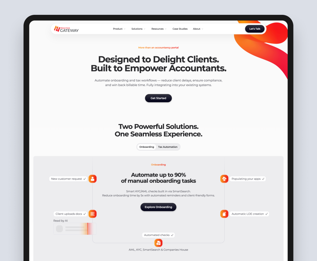
Practice Gateway is a B2B SaaS platform for accountancy practices, helping them manage client onboarding, compliance, and billing in one place. Their challenge was communicating a multi-feature product clearly to practice managers and firm partners who are time-poor and sceptical of software promises. The Rudo project included an interactive ROI calculator that allowed practice managers to model the financial impact of switching to Practice Gateway based on their specific firm size and current software costs. This single feature reduced the sales cycle significantly by giving prospects a concrete, personalised business case to present to partners internally.
Read more about interactive pricing tools in our guide to how interactive pricing tools drive B2B conversions.
Takeaway for your SaaS website
If a first-time visitor to your site cannot explain what your product does in one sentence after spending 10 seconds on your homepage, your messaging is not clear enough. Start there before addressing anything else.
For more on SaaS-specific web design, see our SaaS web design service page.
3. B2B financial services website examples
What great financial services websites do
Financial services B2B websites have to achieve something genuinely difficult: communicating complex, technical, and sometimes regulated propositions to buyers who are inherently cautious. The best sites in this space lead with trust before they lead with features. Regulatory credentials, institutional client logos, team pages demonstrating deep expertise, and precise copy that is not inaccessible.
Rudo client example: Tolerisk
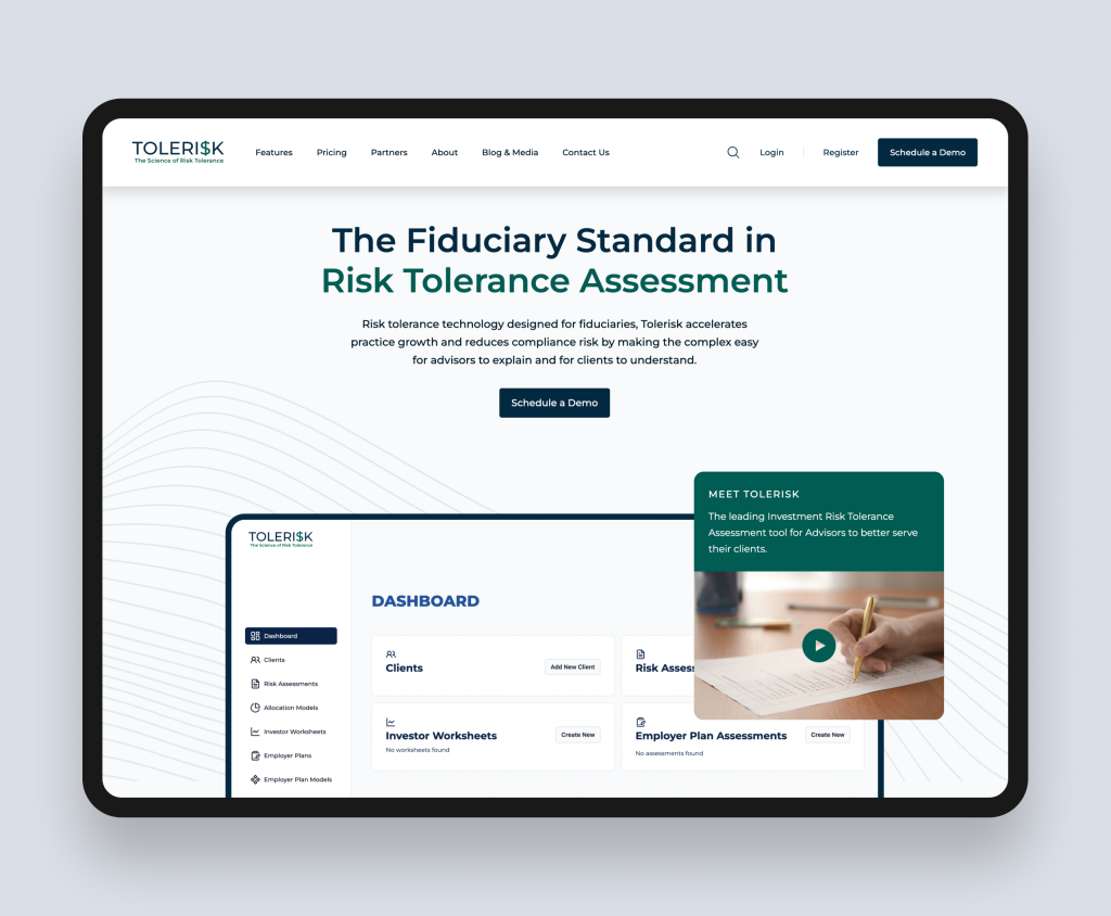
Tolerisk is a risk analytics platform for financial advisers and wealth managers. Their buyer is a senior financial professional who needs to be confident in the platform's credibility before committing to an evaluation. The redesigned site led with regulatory alignment, technical methodology, and the specific outcomes their adviser clients achieve.
Read the full case study: Tolerisk case study.
Rudo client example: Impera Finance
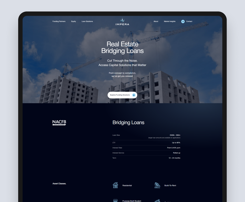
Impera Finance is a real estate capital advisory firm working with institutional investors. Their site communicates the depth of their deal experience and the quality of their relationships in a sector where trust and track record are everything.
Read the full case study: Impera Finance case study.
Takeaway for your financial services website
In financial services, the website's job is to reduce perceived risk. Every design and content decision should be evaluated against this question: does this make it easier or harder for a cautious professional to trust us?
For more on financial services web design, see our financial services web design page.
4. B2B healthcare website examples
What great healthcare websites do
B2B healthcare websites serve a wide range of buyers: NHS commissioners, private hospital procurement teams, clinicians evaluating clinical software, and enterprise buyers at health technology companies. The best healthcare B2B sites communicate clinical rigour and evidence clearly, address compliance and data security proactively, and use trustworthy design language. Accessibility is non-negotiable.
Rudo client example: Psomagen
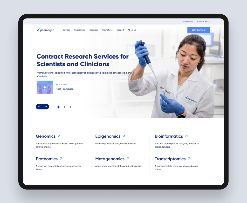
Psomagen is a leading contract research services provider in the field of multiomics, delivering precision-driven research solutions for scientists and clinicians globally. Their existing website failed to communicate the breadth of their services clearly to two very different audience groups: research scientists and clinical professionals. Navigation was fragmented, content was hard to locate, and the site did not differentiate between what each audience needed.
Rudo redesigned the site on HubSpot CMS, beginning with a strategic sitemap that organised content to guide each audience group to the services relevant to them. Targeted copy was produced for each major page, wireframes were developed to establish clear user flows, and the UI design created a clean, professional interface that spoke to both scientists and clinicians. HubSpot CMS empowered the Psomagen team to manage and update content independently, while also enabling their marketing capabilities to grow their reach.
Read the full case study: Psomagen case study.
Takeaway for your healthcare website
In healthcare B2B, the most powerful thing your website can do is reduce the perceived risk of choosing you. Certifications, data security credentials, named NHS or private healthcare clients, and clinical evidence do more for healthcare conversion rates than any amount of design polish. For more on healthcare web design, see our healthcare web design page.
5. B2B property website examples
What great property websites do
B2B property websites tend to serve multiple audiences at the same time: investors, developers, commercial tenants, and regulatory stakeholders. The best property sites segment their audiences clearly and create tailored journeys for each, rather than trying to serve everyone from a single generic homepage.
Rudo client example: Source Investments
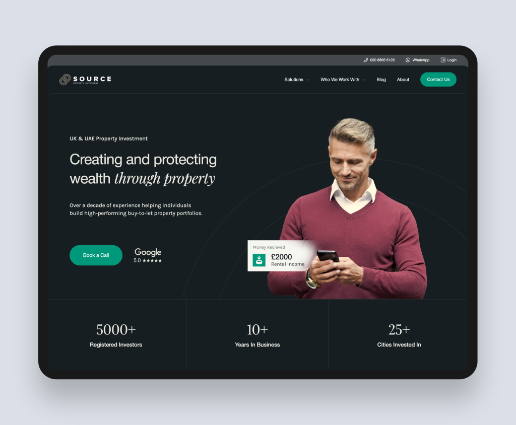
Source Investments had grown significantly but their website still reflected an earlier, smaller version of the business. Their three-service offering of buy, manage, and sell was not clearly communicated. Rudo rebuilt the site on a custom WordPress theme with a new sitemap structured around buyer type: separate journeys for UK investors, international buyers, and existing landlords. A modular design system gives the team flexibility to build new pages without agency involvement.
Read the full case study: Source Investments case study.
Rudo client example: GetGround
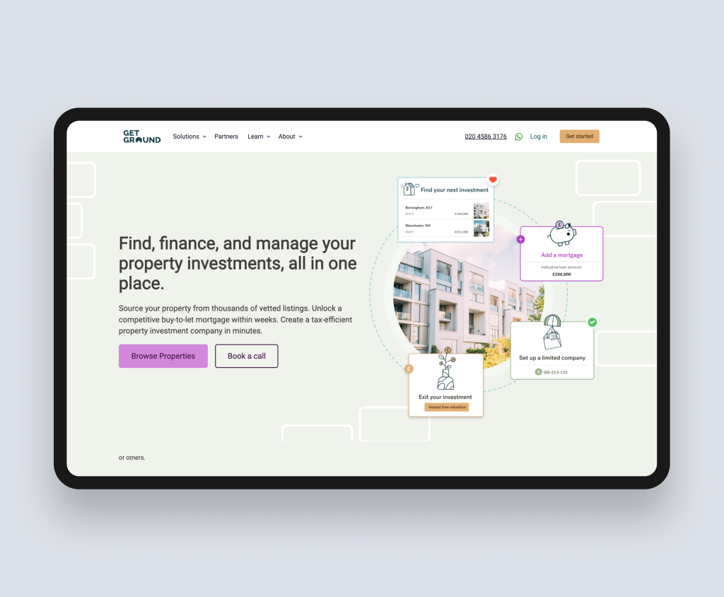
GetGround is the UK's only digital company formation and management platform for buy-to-let property investment. Their site needed to communicate a complex, multi-stage product clearly to property investors who may be unfamiliar with digital formation platforms.
Read the full case study: GetGround case study.
Takeaway for your property website
If your site is trying to speak to investors, developers, tenants, and occupiers from the same homepage, it is probably speaking clearly to none of them. The most impactful change is usually to segment your audience at the navigation level.
For more on property web design, see our property web design page.
6. B2B recruitment website examples
What great recruitment websites do
Recruitment websites face a unique design challenge: they need to attract two fundamentally different audiences simultaneously. The employers who use the agency to hire, and the candidates who want to be placed. The best recruitment websites solve this by segmenting audiences from the first click, creating separate navigation paths and content for each group.
Rudo client example: Ten2Two
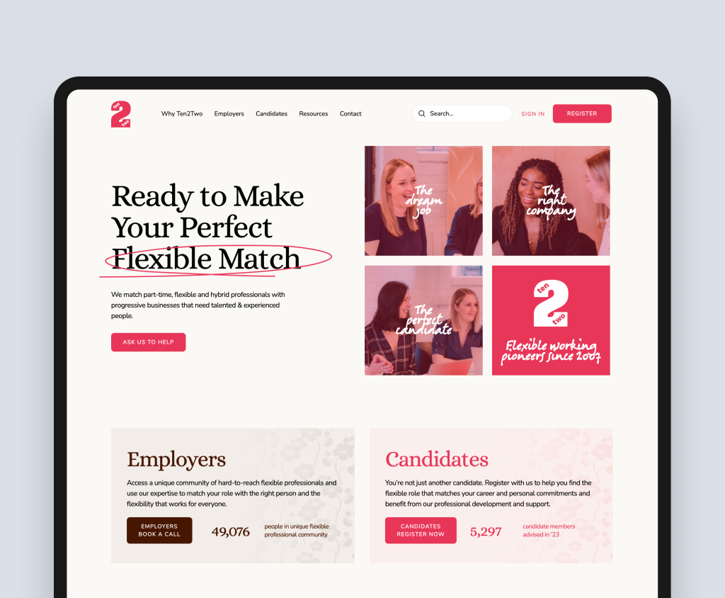
Ten2Two specialises in flexible and part-time professional roles. Their site needed to speak compellingly to both employers (who want senior talent on flexible terms) and candidates (who want meaningful work on their own schedule). The Rudo-built site on HubSpot CMS created distinct content and navigation journeys for each audience while maintaining brand coherence. The result was a site that drove enquiries from both employers and candidates within the first month of launch.
Read the full case study: Ten2Two case study.
Takeaway for your recruitment website
The most common failure in recruitment web design is defaulting to a jobs board as the homepage. Candidates need to search. Employers need to understand your specialism and track record. Build your homepage around your most valuable audience and create a clear path for the other.
For more on recruitment web design, see our recruitment web design page.
7. What the best B2B websites have in common
Across all sectors, the highest-performing B2B websites share these characteristics:
- They start with the buyer, not the business. The homepage answers the visitor's question (is this relevant to me?) before it answers the company's question.
- They use specific, named proof. Not 'clients love us' but 'Gravitee reduced their API management overhead by 40%'. Specificity is credibility.
- They serve multiple buyer stages. There is content for the early researcher, the active evaluator, and the decision-maker ready to make contact.
- They make the next step obvious. Every page ends with a clear, contextually relevant next step. The buyer never reaches a dead end.
- They load fast and work on mobile. Without exception.
- They are easy to update. The best B2B websites are built on platforms that give marketing teams independence.
Ready to talk about your B2B website?
Rudo designs and builds B2B websites that are built to perform, not just to present. If you would like to discuss what a high-performing site would look like for your business, book an intro call. We will look at your current site and tell you honestly what is holding it back.
Back to the complete guide to B2B web design.

Written by
Rudo Agency
Rudo is a strategy-led web design and development agency specialising in B2B. Based in the UK and working with clients globally, we help ambitious brands turn complex ideas into high-performing websites. Our team combines digital strategy, UX/UI design, custom development, and SEO to deliver results-focused websites that support real business growth.
