Overview
The SaaS homepage is the most visited page on your site and the one with the highest bounce rate. Most visitors decide within five seconds whether to stay or leave. That decision is made before they have read a word of body copy, before they have seen your pricing, and before they know anything about your features.
It is made based on a single question: is this relevant to me?
In this article:
- What a SaaS homepage actually needs to do
- The above-the-fold section: five seconds to earn the visit
- The homepage structure that converts
- Social proof: placement is everything
- CTAs: one primary action, multiple entry points
- Real-world example: Practice Gateway
- Common SaaS homepage mistakes
- Frequently asked questions
This guide covers how to design a SaaS homepage that answers that question immediately, keeps the right visitors engaged, and converts a meaningful proportion of them into demos or sign-ups.
This article is part of the complete guide to SaaS web design.
1. What a SaaS homepage actually needs to do
Most SaaS homepages try to do too much. They attempt to explain the entire product, serve every buyer persona, showcase every feature, and convert the visitor in a single scroll. The result is a page that communicates everything and says nothing.
A homepage has three jobs, in this order:
- Confirm relevance. The visitor needs to know within five seconds whether this product is for someone like them, solving a problem they have.
- Establish credibility. Before a visitor will consider your product, they need to believe you are capable of delivering what you claim. This is done through client logos, case study outcomes, review ratings, and the quality of the design itself.
- Direct the next action. Once relevance and credibility are established, the page needs to make the right next step obvious: request a demo, start a free trial, or explore a specific use case.
Everything else on the homepage supports these three jobs. Navigation, feature sections, testimonials, and pricing signals are all in service of moving the right visitor toward the right action.
2. The above-the-fold section: five seconds to earn the visit
The above-the-fold area is the most valuable real estate on your site. It is what a visitor sees before they scroll. Getting it right is more important than everything below it combined, because nothing below it gets seen if the above-the-fold section fails.
The headline
Your headline should state the outcome your product delivers, for whom, in plain language. Not a tagline. Not a brand promise. A specific, outcome-oriented statement that a buyer in your target segment reads and thinks: that is exactly what I am trying to do.
The test is simple: could this headline appear on a competitor's site? If yes, it is not specific enough. If no, you have a positioning statement rather than a generic aspiration.
| Weak headline vs strong headline |
| Weak: Transform the way your team works. Strong: Give your RevOps team a single source of truth for pipeline data, without the spreadsheet chaos. The first could be any SaaS product. The second speaks to a specific person with a specific problem. |
The subheadline
The subheadline has one job: extend the headline by clarifying who the product is for and adding one specific proof point or feature detail that earns the claim. One to two sentences. No jargon. No metaphors.
The primary CTA
One primary CTA above the fold. Not two. If you offer both a free trial and a demo, pick the one that is right for most visitors and put it here. The second option can appear lower on the page or as a secondary button in a lighter style.
The hero visual
The hero visual should show the product in use, not an abstract illustration. A screenshot of the core interface, a short looping product video, or an animated UI walkthrough all outperform generic visuals. The visual answers the question: what does this actually look like?
For a broader framework on how SaaS buyers evaluate products, read our guide to SaaS demo conversion optimisation.
3. The homepage structure that converts
Below the fold, a high-converting SaaS homepage follows a predictable structure. This is not a template: it is the logical order of information that mirrors how a sceptical buyer builds confidence.
Social proof bar
Immediately below the hero section: a horizontal row of recognisable client logos. No text needed. This answers the implicit question: do companies I recognise use this? If yes, the visitor's threshold for continuing drops significantly.
Problem statement
A short section that names the problem your product solves, in the language your buyers use to describe it. This is not about your features. It is about demonstrating that you understand the frustration your buyer experiences every day without your product.
Product demonstration
A demonstration of the product solving the problem. This can be a product tour, a feature walkthrough, a before-and-after illustration, or a tabbed interface that shows the product in different contexts. The goal is to make the abstract concrete.
Use case or audience segmentation
A section that helps different buyer types self-select: for engineering teams, for marketing operations, for enterprise procurement. This allows a single homepage to serve multiple buyer personas without trying to speak to all of them at once in the hero section.
Social proof with outcomes
A case study section or testimonial block with specific, named, measurable outcomes. Not we love this product but we reduced time-to-close by 30% in the first quarter. See below for guidance on placement.
Integration or ecosystem section
A section showing the tools your product connects to. For many SaaS buyers, particularly technical evaluators, this is a decision factor. If your product does not connect to their existing stack, it will not get past the evaluation stage regardless of how good the homepage looks.
Secondary CTA
A second conversion opportunity, typically placed two-thirds of the way down the page. By this point, a visitor who has scrolled this far is engaged. Do not make them scroll back to the top to take action.
4. Social proof: placement is everything
Most SaaS homepages place social proof in a testimonials section that visitors reach after scrolling past everything else. This is the wrong approach. Social proof is most effective at the moments of highest hesitation, which on a homepage occur in three specific places:
- Immediately below the hero. A logo bar before the visitor has had a chance to form doubt removes the first barrier to engagement.
- Adjacent to feature claims. When you make a claim about your product's capability, a short quote from a named customer validating that claim carries significantly more weight than the claim alone.
- Directly above the primary CTA. The moment before a visitor clicks a CTA is the moment of highest hesitation. A specific outcome statement from a real customer placed here reduces drop-off at the most critical conversion point.
The format of social proof also matters. A named person with a job title and company name is more credible than an anonymous testimonial. A specific number (reduced manual reporting by 6 hours per week) is more credible than a vague positive (saved us so much time). Aim for both.
5. CTAs: one primary action, multiple entry points
The most common CTA mistake on SaaS homepages is offering too many options at once: Get started, Book a demo, Start free trial, Watch a video, Learn more. Each additional option reduces the likelihood of any action being taken.
The principle is: one primary action per page, with secondary options available for visitors who are not ready for the primary action.
Choosing your primary CTA
Your primary CTA should reflect the action that produces the most qualified leads for your sales process. For most SaaS companies, this is either a demo request or a free trial sign-up. The right choice depends on your product complexity and sales motion:
- Request a demo: best for complex products where a guided walkthrough is necessary to communicate value, or where the sales process involves qualification before access.
- Start free trial: best for simpler products where the value is evident from using the product directly, and where self-serve onboarding is strong enough to convert trial users to paid.
Secondary CTAs for earlier-stage visitors
Not every visitor is ready to request a demo or start a trial. Secondary CTAs serve the researcher who wants more information before committing to any action. These include: watch a product tour, read a case study, explore pricing, or see it for your use case. These should be visually subordinate to the primary CTA but present throughout the page.
6. Real-world example: Practice Gateway
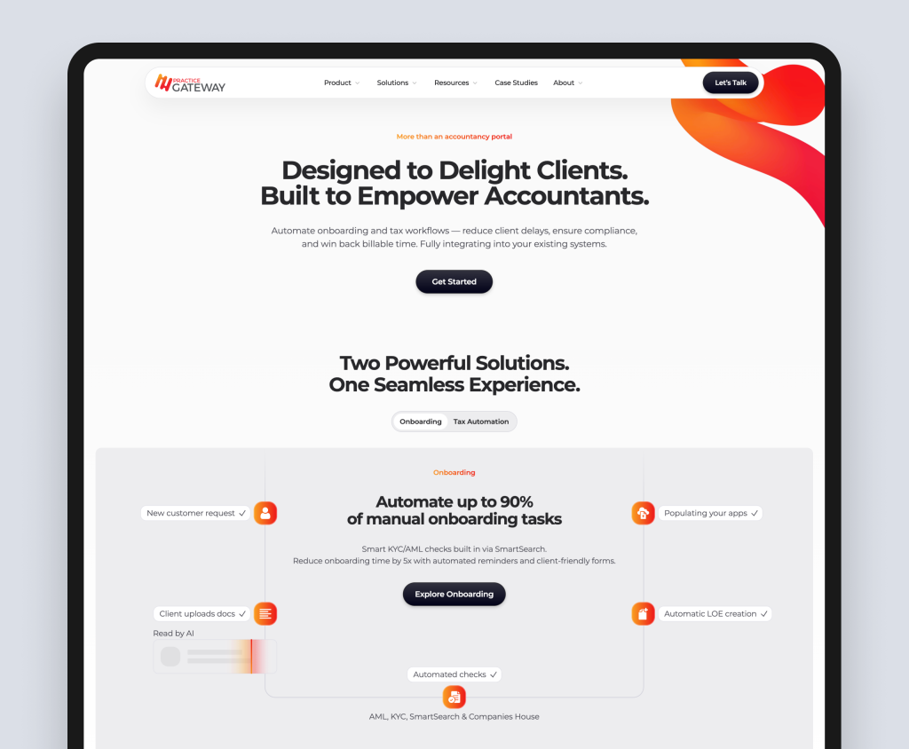
Practice Gateway is a B2B SaaS platform for UK accountancy firms, automating client onboarding and personal tax workflows. Rudo designed and built the site. It is a strong example of homepage principles applied to a technically complex product for a risk-averse, time-poor audience. The site is live at practicegateway.com.
What the homepage does well
- Outcome-first headline. The hero leads with Designed to Delight Clients. Built to Empower Accountants. This immediately addresses both audiences the platform serves (clients and accounting teams) and frames the product around what changes for them, not what it technically does.
- Specific, quantified value statements. The two product sections use Automate up to 90% of manual onboarding tasks and Save up to 70% of time spent on tax returns. These are not vague efficiency claims. They are specific numbers a practice manager can take into a partner meeting as a concrete business case.
- Two-product tab structure. Rather than merging two distinct products into a confusing single description, the homepage uses a tabbed section (Onboarding and Tax Automation) so each audience self-selects into relevant content. The page stays clean without sacrificing depth.
- Problem-framing before solution. The Why Practice Gateway Exists section names the specific problem: fragmented legacy software and manual admin causing inconsistent client experiences. This is written from the buyer's perspective and positions the product as the solution to a problem the buyer already knows they have.
- Role-based solutions navigation. The Solutions menu is structured by function (Leadership Team, Tax Team, Onboarding Team, Compliance Team, IT Team) rather than by product feature. This acknowledges that multiple people within the same firm will evaluate the platform and gives each a direct path to content written specifically for their concerns.
- Client logo bar. A trust bar of recognisable UK accountancy firm logos appears early in the page, providing social proof before the buyer has engaged deeply. The implicit message: firms like yours have already made this choice.
- Interactive ROI calculators. Separate calculators for Onboarding and Tax Automation allow practice managers to input their own firm data and receive a personalised time-saving estimate. This is one of the most effective conversion tools a SaaS company can offer a risk-averse B2B buyer: a self-service business case they can share internally without needing a sales call to get there.
What to take from this example
Every element on the Practice Gateway homepage serves a specific buyer at a specific moment in their evaluation. The headline speaks to both audiences simultaneously. The ROI statistics give cautious buyers concrete numbers to justify the decision. The role-based navigation acknowledges that multiple stakeholders evaluate the same platform. And the ROI calculators create a self-service path to an internal business case before a sales conversation has started.
These are not design choices. They are strategic decisions made because the site was built around who the buyers are, what they are afraid of, and what they need to see before they are ready to act. That is what good SaaS homepage design looks like in practice.
| About this example |
| Rudo designed and built the Practice Gateway website, including the interactive ROI calculators. The project included discovery, positioning strategy, copywriting, UI design, and development. View the full case study |
7. Common SaaS homepage mistakes
Leading with the company, not the buyer
Homepages that open with our mission is to revolutionise, we are a leading provider of, or founded in 2019 are speaking to internal stakeholders, not buyers. A buyer landing on your homepage for the first time does not care about your mission. They care whether you can solve their problem.
Feature-first rather than outcome-first messaging
Listing features in the hero section communicates capability but not relevance. A buyer needs to understand the outcome before they care about the mechanism. Lead with what the product does for them, then explain how it does it.
No product visible above the fold
Abstract illustrations and stock photography tell a buyer nothing about the product. The fastest way to communicate what a SaaS product does is to show it. Even a single high-quality interface screenshot in the hero section dramatically outperforms illustration in terms of visitor engagement.
Generic social proof
A testimonial that says great product, highly recommend from John S., CEO, is not social proof. It is noise. Every claim of social proof on your homepage should include a full name, a job title, a company name, and a specific outcome or experience.
No mobile consideration
B2B SaaS buying decisions happen on desktop but first impressions happen everywhere. A CMO who sees your product mentioned on LinkedIn checks your homepage on their phone. If the above-the-fold section is broken, the headline is truncated, or the CTA is hard to tap, you have lost them before the conversation started.
8. Frequently asked questions
What should a SaaS homepage include?
A high-converting SaaS homepage should include: a clear outcome-oriented headline above the fold, a product visual (screenshot or demo video), a primary CTA, a social proof logo bar, a problem statement section, a product demonstration section, use-case segmentation for different buyer types, named case study outcomes, an integration or ecosystem section, and a secondary CTA.
How long should a SaaS homepage be?
Long enough to move a sceptical buyer from relevance to credibility to action. For most SaaS products this means 6 to 10 distinct sections below the hero. Shorter homepages leave buyers without the evidence they need. Longer homepages bury the conversion opportunities. The right length is determined by your buyer's research depth, not by a word count.
Should a SaaS homepage have a demo video?
Yes, if it is under 90 seconds and shows the product solving a specific problem rather than showcasing all its features. Long feature-tour videos have low completion rates. Short, focused product demonstrations that show a specific workflow or outcome perform significantly better. Place it in the product demonstration section, not above the fold.
How often should a SaaS homepage be redesigned?
A full redesign is rarely necessary more than once every two to three years. Continuous improvement through A/B testing of headlines, CTAs, and social proof placement is more effective and less disruptive than periodic redesigns. Redesign when your positioning changes significantly or when the underlying architecture of the site no longer serves your buyer journey.
Ready to talk about your SaaS website?
Rudo builds SaaS homepages that convert. We start with your buyer journey and work backwards to design a page that earns the visit, builds confidence, and drives the right action. Book an intro call to discuss your homepage.
Find out more about our SaaS web design services.

Written by
Rudo Agency
Rudo is a strategy-led web design and development agency specialising in B2B. Based in the UK and working with clients globally, we help ambitious brands turn complex ideas into high-performing websites. Our team combines digital strategy, UX/UI design, custom development, and SEO to deliver results-focused websites that support real business growth.
