Overview
The most useful SaaS website examples are not the ones that have won design awards. They are the ones that have generated qualified pipeline, shortened sales cycles, and positioned their companies clearly in competitive markets.
This guide draws on Rudo's SaaS client work to show what high-performing SaaS websites actually do, and explains the decisions behind each approach so you can apply the principles to your own site.
In this article:
- What makes a SaaS website genuinely effective
- API management and developer tools
- Event analytics and data platforms
- Practice management and vertical SaaS
- PropTech and real estate SaaS
- Principles behind the best SaaS websites
- What to take from these examples
This article is part of the complete guide to SaaS web design.
1. What makes a SaaS website genuinely effective
Before looking at examples, it is worth being specific about what effective means. A SaaS website is effective when it does these things consistently:
- Converts qualified visitors into demo requests or trial sign-ups at a rate of 1 to 3% or above
- Communicates the core product value clearly enough that demo requests arrive pre-educated, shortening the sales conversation
- Serves multiple buyer personas without making any of them feel the site is not for them
- Ranks for the search terms buyers use when researching the product category
- Gives the marketing team the independence to build and test new pages without developer support
The examples below are evaluated against these criteria, not against visual design trends.
For conversion rate benchmarks, read our B2B website conversion rate guide.
2. API management and developer tools: Gravitee
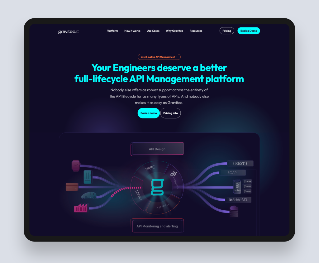
The challenge
Gravitee is a leading open-source API management platform with an enterprise product layer. Their website challenge was one of the most technically demanding in SaaS web design: communicating a genuinely complex platform to two very different audiences simultaneously. Developer evaluators who want to see documentation, architecture diagrams, and integration details. And enterprise procurement stakeholders who want to see business outcomes, security credentials, and client references.
Most SaaS companies in this position default to a developer-focused site that loses the business buyer, or a business-focused site that loses the technical credibility. Getting both right on the same site requires a deliberate content architecture.
What Rudo built
The Rudo-rebuilt site on HubSpot CMS restructured the content around distinct buyer journeys. The navigation separates product, solutions, and resources in a way that allows each buyer type to find their relevant content without wading through material aimed at someone else. A comprehensive resources hub serves developers with technical documentation while serving architects and procurement teams with use-case and outcome-focused content. The template library was expanded to give the Gravitee marketing team the ability to build campaign landing pages, product update pages, and regional content without developer involvement.
The principle
When your product serves multiple technically distinct buyer personas, the content architecture has to do the segmentation work your homepage cannot do alone. Navigation, resource organisation, and the depth of content at each level of the site determine whether each buyer type finds what they need or leaves in frustration.
Read the full case study: Gravitee case study.
Find out more about our SaaS web design service.
3. Event analytics and data platforms: Event Footprints
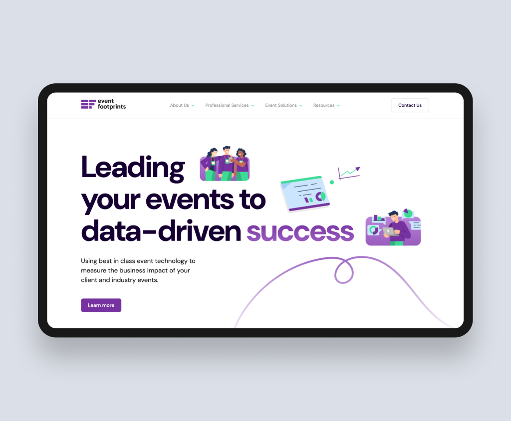
The challenge
Event Footprints provides behavioural data and analytics for event organisers: a product that helps businesses measure the ROI of their events through on-site engagement tracking. The challenge was that their original website failed to communicate this value at all. The core offering was buried in generic language about insights and engagement, and the site structure made it hard for a visitor to quickly understand what the platform actually did.
In SaaS, this is the most common homepage failure mode: a product with genuine, specific value presented through vague marketing language that could apply to dozens of competitors. When messaging is generic, buyers cannot differentiate and do not convert.
What Rudo built
The redesigned site on HubSpot CMS restructured every page around the specific outcome Event Footprints delivers: helping event organisers measure what actually happened at their event and use that data to improve future events. The homepage hero was rebuilt around a concrete value statement rather than a brand aspiration. Use-case content was organised around the types of events the platform serves. Interactive elements were added to demonstrate the data outputs the platform generates. HubSpot CRM integration enabled the team to track every visitor interaction from first page view to demo request, giving the sales team visibility into what content a prospect had engaged with before the first call.
The principle
Specificity in SaaS messaging is not just a copywriting preference: it is a conversion driver. A homepage that says exactly what your product does, for whom, and with what result will outperform one that communicates general capability. The fastest way to improve a SaaS homepage conversion rate is almost always to make the hero section more specific, not more designed.
Read the full case study: Event Footprints case study.
4. Practice management and vertical SaaS: Practice Gateway
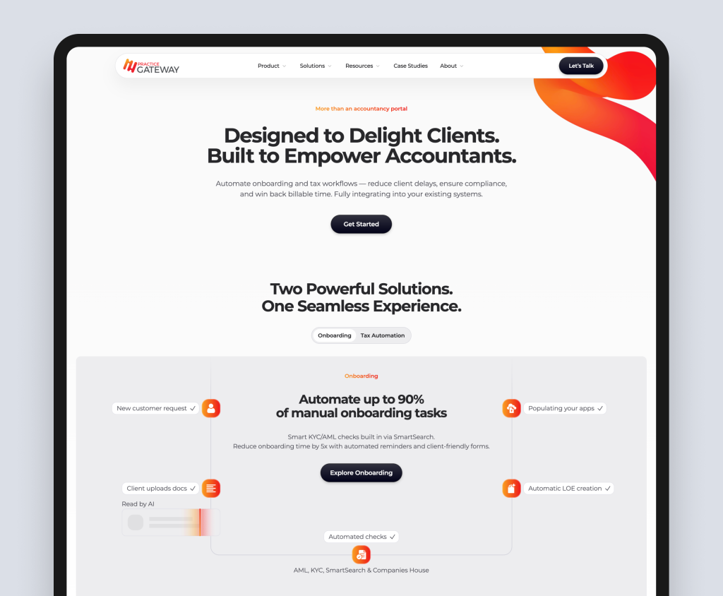
The challenge
Practice Gateway is an accountancy practice management platform. Vertical SaaS products face a specific design challenge: the buyer is often a domain expert with high scepticism about technology promises and low tolerance for generic marketing language. An accountancy practice manager has seen dozens of software platforms promise to transform their practice and deliver incremental improvements at best. The website needs to do something harder than communicate features: it needs to rebuild trust in the category.
What Rudo built
The central innovation on the Practice Gateway site is an interactive ROI calculator that allows practice managers to input their specific firm details: number of staff, current software costs, hours spent on manual processes. The calculator outputs a personalised estimate of time saved, cost reduction, and revenue recovered per year.
This solves two problems simultaneously. It converts the abstract promise of efficiency into a concrete, personalised business case. And it gives buyers the internal ammunition they need to present the investment to their partners without requiring a sales call to get there. Demo requests that came in from calculator users arrived with a completed business case already attached, which shortened the sales cycle significantly.
The principle
In vertical SaaS, where buyers are domain experts, interactive tools that personalise the value calculation outperform generic feature lists by a wide margin. The calculator is not a gimmick: it is a conversion tool that replaces the part of the sales process that would previously require a discovery call.
Read more about interactive tools in our guide to how interactive pricing tools drive B2B conversions.
Read the full case study: PracticeGateway case study.
5. PropTech and real estate SaaS: GetGround
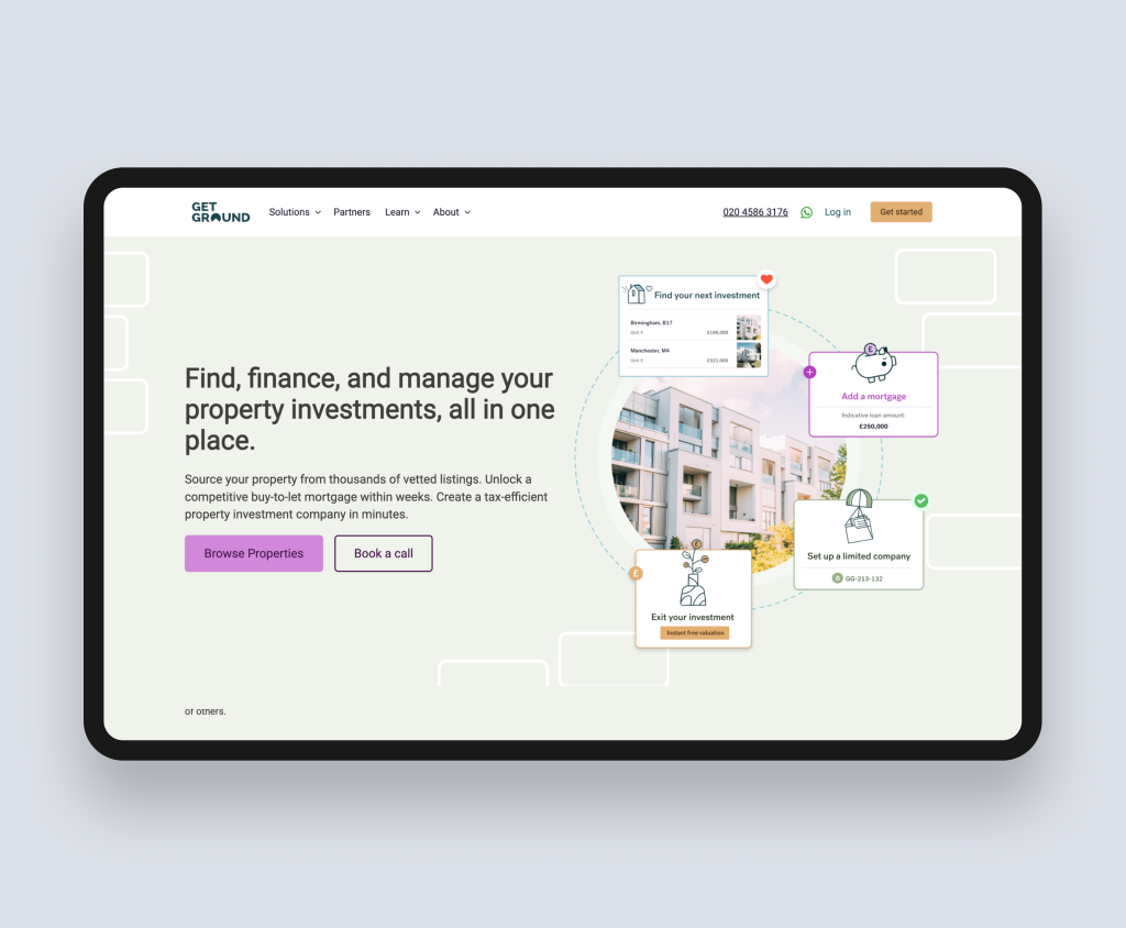
The challenge
GetGround is the UK's only digital platform for company formation and management in buy-to-let property investment. Their challenge was communicating a multi-stage product that covers property sourcing, mortgage solutions, and company formation in a single platform. For buyers unfamiliar with the concept of a digital formation platform, the site needed to do significant educational work before it could convert.
The additional complexity was audience segmentation: new property investors who need everything explained, and experienced landlords who understand the category and want to evaluate the platform's capabilities quickly. These two groups have very different information needs and very different patience levels.
What Rudo built
The Rudo-rebuilt site on HubSpot CMS created distinct content journeys for each audience segment. The navigation and homepage architecture allowed new investors to follow a guided path through the product's value proposition, while experienced investors could navigate directly to the specific capabilities they wanted to evaluate. The design created a clean, confidence-inspiring interface that communicated the platform's maturity without overwhelming new investors with complexity.
The principle
When your SaaS product serves buyers at meaningfully different levels of sophistication, the site architecture needs to create separate paths rather than a single homepage that tries to serve both. Segmentation at the navigation level, supported by audience-specific landing pages, allows you to speak with specificity to each group without alienating the other.
Read the full case study: GetGround case study.
6. Principles behind the best SaaS websites
Across all of these examples, the same principles appear regardless of industry, growth stage, or product complexity.
- Outcome-first messaging. Every high-performing SaaS site leads with what the product achieves for the buyer, not what it does. The feature description comes after the outcome has been established.
- Deliberate content architecture. The best SaaS sites are not collections of pages. They are structured journeys designed for specific buyer types at specific stages of the purchase process.
- Social proof integrated into the page, not appended to it. Case study outcomes, client logos, and testimonials are placed at moments of hesitation, not in a dedicated section that buyers scroll past.
- Conversion tools that replace sales conversations. The highest-performing SaaS sites include interactive elements that give buyers what they need to build an internal business case without requiring a call first.
- Marketing team independence. Every example above is built on a CMS that allows the marketing team to build new pages, update content, and respond to product changes without raising development tickets.
7. What to take from these examples
The most useful thing to take from these examples is not their visual style but their structural logic. Before spending anything on design, answer these questions about your current site:
- Does your homepage hero section communicate a specific outcome for a specific buyer, or a general capability for anyone?
- Does your site architecture create a clear path for each of your distinct buyer types, or does everyone land on the same homepage and have to work out where to go?
- Is your social proof placed at moments of hesitation, or in a testimonials section that few buyers reach?
- Is there anything on your site that helps buyers build an internal business case without speaking to your sales team first?
- Can your marketing team build and launch a new landing page without raising a development ticket?
If the answer to most of these is no, the highest-leverage changes are strategic and structural, not visual. A reskin of an architecturally weak site produces a site that looks better and performs the same.
For a full redesign framework, read our SaaS website redesign guide.
Ready to talk about your SaaS website?
Rudo builds SaaS websites that generate pipeline. If you would like to discuss what a high-performing site would look like for your product, book an intro call. We will review your current site and tell you honestly what is holding it back.

Written by
Rudo Agency
Rudo is a strategy-led web design and development agency specialising in B2B. Based in the UK and working with clients globally, we help ambitious brands turn complex ideas into high-performing websites. Our team combines digital strategy, UX/UI design, custom development, and SEO to deliver results-focused websites that support real business growth.
