LedgerBee
AI-Native ERP for SaaS & Subscription Businesses
LedgerBee is a Danish AI-native ERP platform built for SaaS and subscription businesses, unifying general ledger, accounts payable, accounts receivable, payroll, corporate cards, subscription billing and forecasting in a single system. Powered by Hivey AI, the platform replaces the fragmented finance stacks that growing businesses outgrow.
Scope of Project:
background
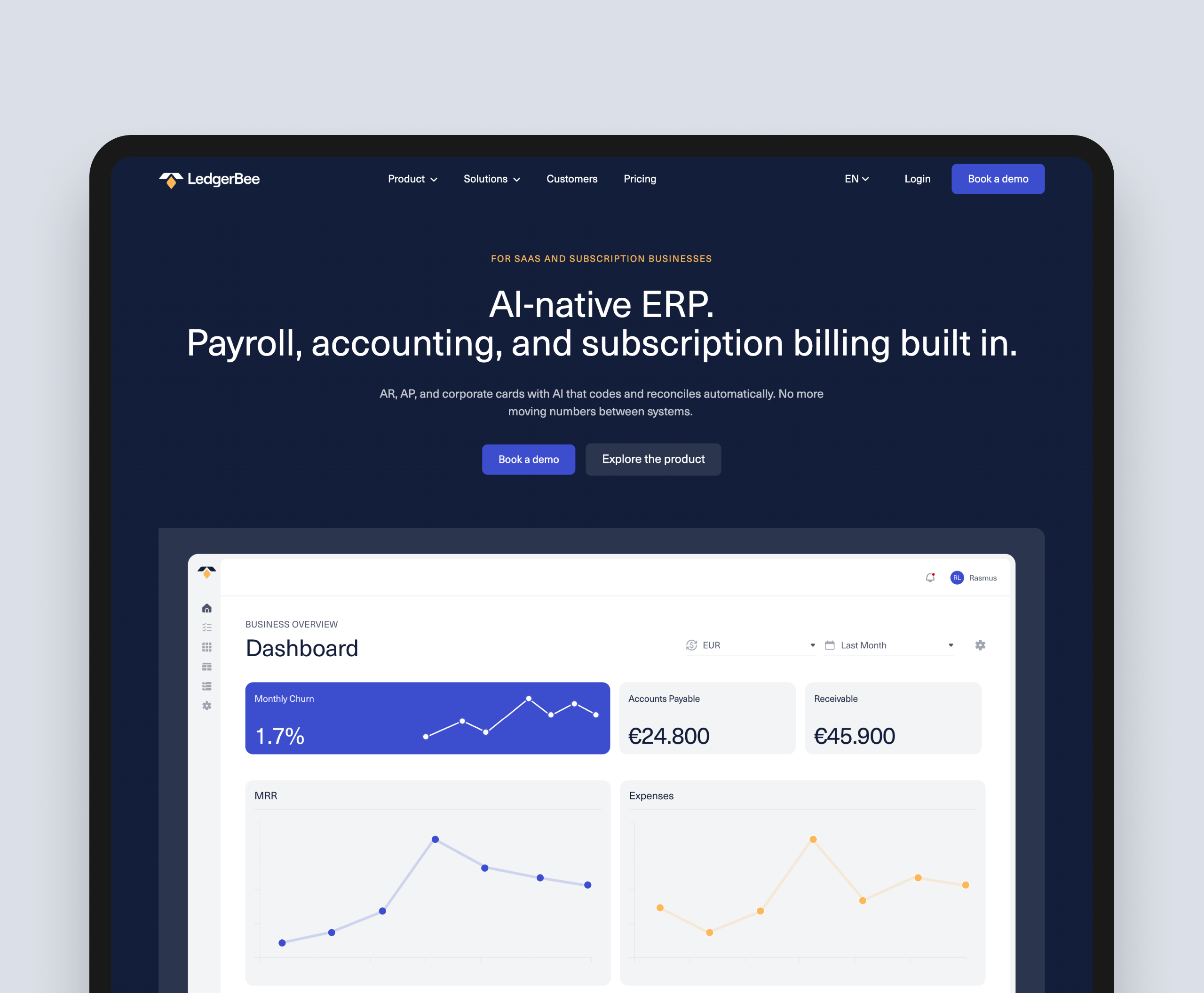
LedgerBee approached us to design and build the website that would carry the brand into its next stage of growth. As an AI-native ERP competing against entrenched legacy players, LedgerBee's value proposition is genuinely different from the rest of the market: one platform replacing six, real-time numbers replacing month-old reports, and AI that codes and reconciles automatically. But the existing digital presence wasn't communicating any of that with the clarity it deserved. The brief was a complete design and build, on HubSpot, that would do four things at once: explain a complex multi-module platform to a finance and founder audience, support full multi-language delivery in English and Danish, give the team a CMS-native foundation for ongoing experimentation, and convert qualified visitors into demo bookings at a measurably higher rate.
challenge
The product complexity was the central design challenge. LedgerBee covers twelve distinct product modules across two tiers (Core and Advanced), serves four solution audiences (SMEs, Enterprise, Accountants & Bookkeepers, Partners), and competes against legacy ERPs that prospects already know but don't love. Every product page needed to explain a specific module in a way a CFO or finance lead could absorb in seconds, while the platform-level pages had to communicate the bigger picture of a unified system replacing a fragmented stack. Writing alone wasn't going to do that work. The site needed a visual language strong enough to carry meaning across dozens of pages.
The multi-language requirement added another dimension. The site had to deliver a full English and Danish experience with consistent quality, with a CMS structure that allows the LedgerBee team to extend or update content in either language without breaking layouts or duplicating effort. There were also harder commercial constraints: the "Book a demo" CTA is the primary conversion point for the business, so the site had to be built from day one with experimentation in mind. A/B testing wasn't an afterthought, it was a foundation. Every key template needed to be set up so the team could test variants of headlines, illustrations, CTA placement and supporting trust elements continuously after launch.
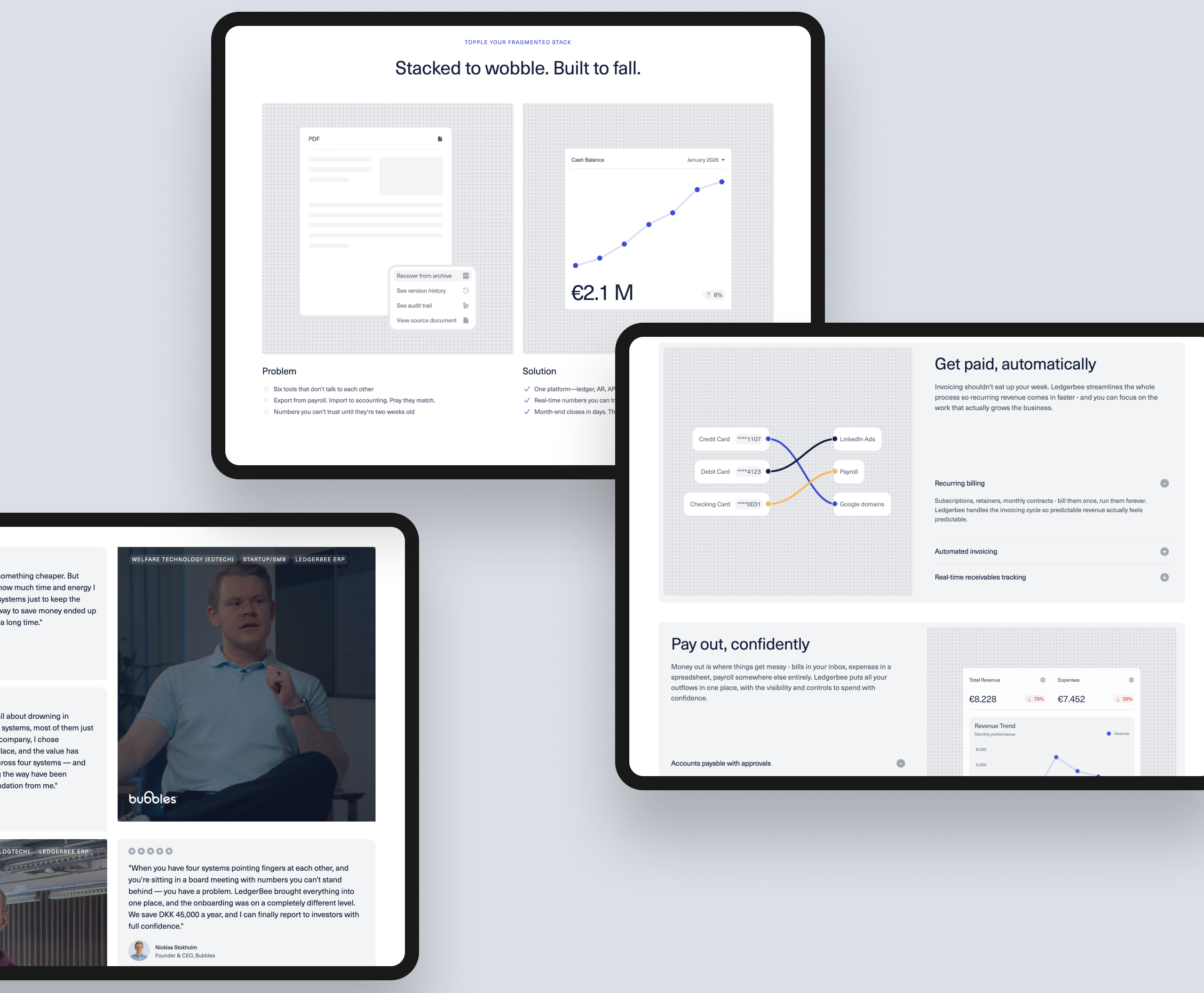
The illustration challenge was significant in its own right. Each of the twelve product modules needed its own set of visuals showing how the feature actually works inside the platform, plus broader brand illustrations across solutions pages, the homepage and supporting templates. We produced a substantial library of custom illustrations from scratch, all built to a unified style system so that a visitor moving from General Ledger to Subscription Management to Hivey AI experiences a coherent visual story rather than a patchwork of separate assets.
solution
We started with a discovery phase covering stakeholder interviews across product, marketing and customer success, an analysis of how prospects currently moved through the existing site, and a review of the competitive landscape across legacy ERPs and modern finance platforms. The strategic insight that came out of this work shaped the project: LedgerBee's biggest commercial lever wasn't more features on the page, it was making the value of a unified platform legible at a glance. Visitors needed to see, not just read, why one system beats six. That insight pointed us toward a design system anchored by custom illustrations as the primary explanatory device, with copy and structure built around them rather than the other way around.
From there, we restructured the site around two primary navigation pillars (Product and Solutions) with clear pathways into each of the twelve modules and four audience segments. The homepage and product pages were designed around a "problem versus solution" architecture that mirrors how LedgerBee actually wins deals against legacy ERPs, with comparison tables, real customer quotes and outcome-focused metrics built into the templates. The custom illustration system became the connective tissue across the whole site, with each module getting its own visual treatment that explains the workflow without relying on screenshots that age quickly.
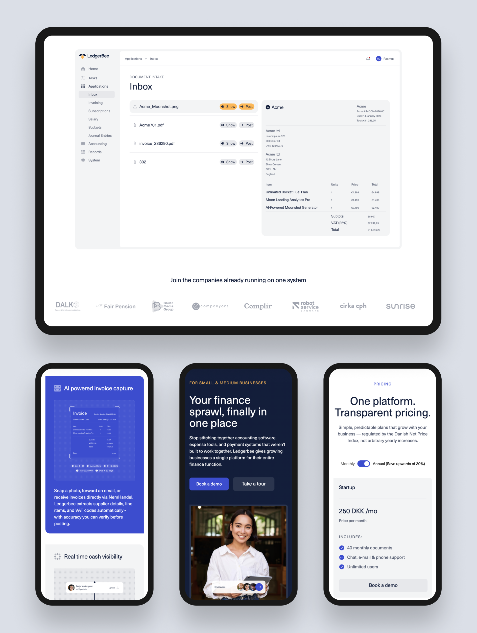
The site was built on HubSpot CMS with a fully custom theme and modular block library, giving the LedgerBee marketing team full control over publishing without developer involvement. Multi-language was implemented natively through HubSpot's language variants, with translation workflows set up so the team can publish parallel English and Danish content from a single admin experience. A/B testing was implemented across the conversion-critical templates, with the "Book a demo" CTA, hero variants, comparison sections and pricing page set up as ongoing experiments rather than one-off tests. Customer testimonials, video case studies and the "Real results from real teams" section were architected as flexible modules so the marketing team can keep refreshing social proof as new wins come in.
result
The new LedgerBee website now communicates the value of an AI-native ERP with the clarity it deserves. The custom illustration system makes a complex multi-module platform legible at a glance, the dual-language experience reaches LedgerBee's full addressable market in both English and Danish, and the A/B testing foundation gives the team a platform engineered for continuous improvement rather than a one-time launch. The "Book a demo" journey is now a measurable, optimisable conversion path, and the marketing team has a HubSpot CMS they can extend without developer involvement.
Website traffic
+0%
Conversion rate
+0%
Bounce rate
-0%
Time on site
+0%
Page load speed
-0%
get in touch
Ready to make some digital magic together? Let's chat about your project and bring your online dreams to life. Get in touch for a free consultation!

They have been the perfect fit for the type of website development and design partner that our business needs.
Tom Pittman
Marketing Director, Medical Practice Firm